Colours can be one of the most important aspects of your web design- they can make or break your site. Luckily, some tried, and true colour schemes work well for websites. This blog post will share some dos and don’ts for choosing web-friendly colours. Keep reading to learn more!
What are web-safe colours?
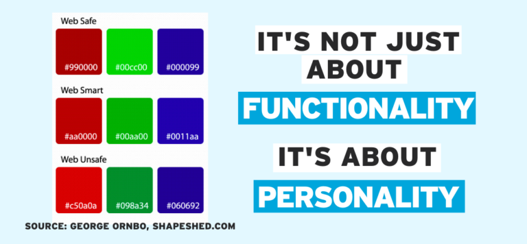
Web-safe colours are fundamental in the realm of web design and browser functionality. There’s a limited palette of 256 shades that you can use in any browser or app without the risk that they’ll look altered when viewed on a website. This ensures that website logos, branding, and other visual elements maintain their original hues. Even if you adjust your browser settings to view richer colours, these web-safe colours will remain reliable and consistent. So be sure you’re conscious of this unique colour palette as you set out to design an eye-catching website!

Finding what works for your brand
If you’re looking to define your branding, it’s essential to consider the atmosphere and aesthetic of your business and its functionality. Your business’s branding should communicate who you are, your values, and what sets you apart from the competition. Look at branding strategies used by other successful companies and think about how you can implement those elements while still being true to who you are. Find what branding components work best for your particular needs, and remember that it doesn’t have to be complicated– all that matters is finding the right mix of elements that reflect the spirit of your brand.Why am I just learning about web-safe colours now?
In the past, computers could only use RGB (Red-Green-Blue) 8-bit colour palettes, limiting the total number of available colours to 216, which comprised our web-safe colours. However, with modern technology, higher-bit RGB and CMYK systems have allowed us to access a much more comprehensive range of dynamic shades than ever. And while we can now choose from a seemingly endless number of tones and hues, it’s clear that understanding the concept of web-safe colours is still important in many aspects of graphic design and tech today. Who’d have thought those few 216 shades would remain relevant even now?
Don’t use colours that clash with each other – this will create confusion and make it difficult for people to read your site.
Things to avoid when choosing colours for your website
When updating or designing a website, colour is an important element to consider. Choosing the right colours can bring life and energy to your website, while the wrong combination may distract viewers and take away from the messages you are trying to convey. Have you heard of ‘artifacts’? All those horrible images that look stretched and distorted due to low-quality JPEGs? Avoid this by ensuring your website colours are displaying correctly on all devices. Utilizing a bit of colour theory in your selection can also help – for example, contrasting colours create emphasis, helping visitors differentiate between different parts of your website easily. With a little extra effort when deciding on the best colour combination, you can give your viewers an enjoyable experience and keep them coming back.

In Conclusion
So there you have it, some do’s and don’ts for choosing the right colours for your website. Just remember that people will be looking at your site for long periods, so you want to ensure that the colours are easy on the eyes. You also want to ensure that your colour scheme is cohesive and makes sense for your business. If you need some help finding the perfect combination of colours for your website, Sociable Media can help. We specialize in creating custom websites that reflect your business’s personality and have all the functionality to keep your customers coming back. Contact us today to learn more about how we can help you create a website that looks great and is easy to use.